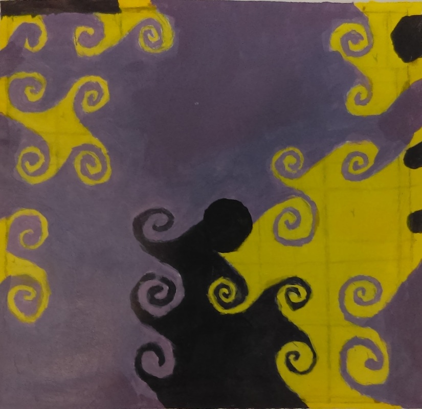
 I choose to paint this pattern that I had taken a picture of. I decided to paint this because I thought that the interesting pattern would look really cool in my painting, with all the swirls.
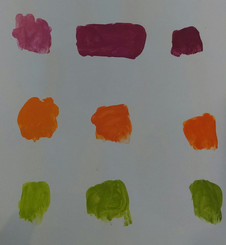
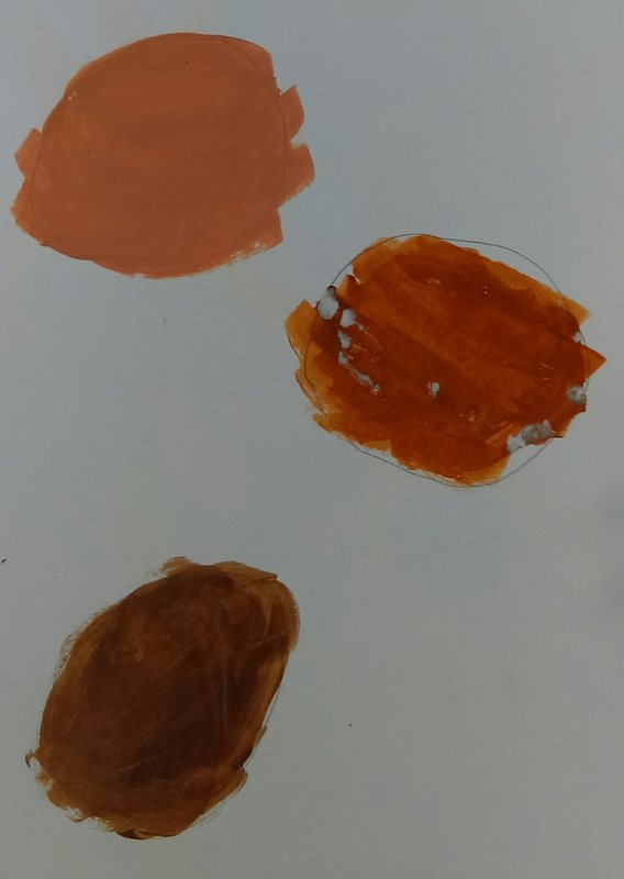
It was hard to mix the color swatches because it was our first time mixing paint. We had trouble getting the shading exactly right, and it was hard to change the color in the way that was wanted. We made brown by either combining the three primary colors, or by mixing a primary and a secondary color from opposite sides of the color wheel. 
0 Comments
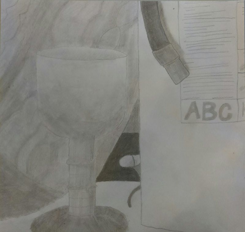
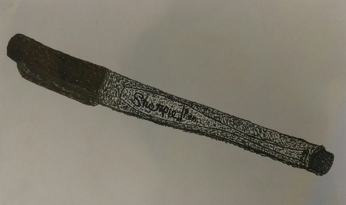
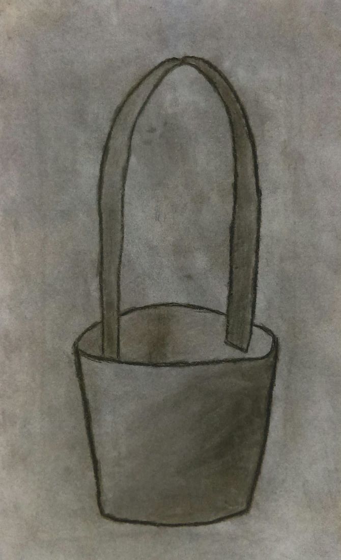
The warm up that was the most helpful during this unit was the Sign language A, because hands are something that I am not really good at, and my hand looked really good in comparison to other hands I have done in the past. 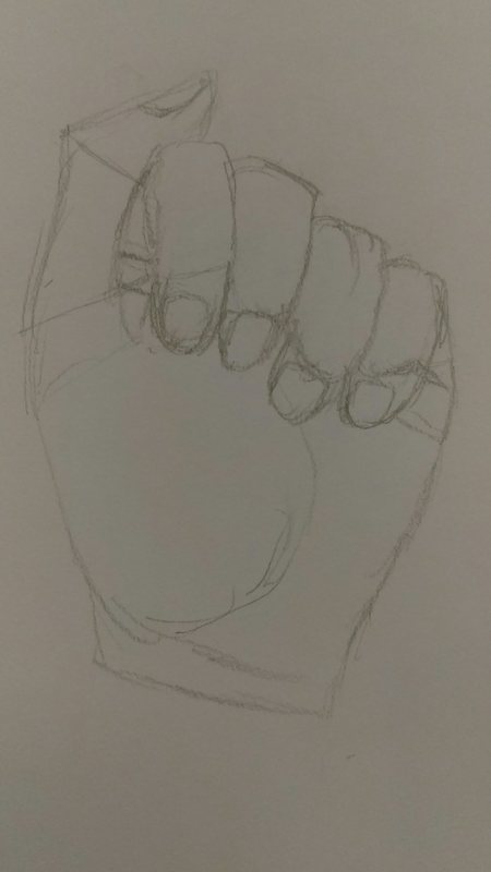 Value is the element of design that defines the light and darks in an artwork. Value is what controls what areas are light, and what areas are dark in an art piece. Composition is the placement of visual elements or ingredients in a work of art. Composition is the organization of the elements of art according to the principles of art. Composition is how your artwork is arranged. Over this drawing unit, we used many different mediums in order to create of artwork. The mediums we used were pen, charcoal, and pencil. Each one of these mediums had their own pros and cons. The pencil is my favorite medium. Pencils are easy to fix a mistake if you make one. Pencils give you the best control of value in a piece. However, the pencil is a slight shade of gray, which will reduce the contrast in your drawing. Charcoal, however, allows for better contrast between the light and the dark in your piece. Charcoal is more of a dark medium, so it doesn't allow for as much light values as pencils do. Pens have precise lines, and while they are only one color with no values, value can be added using varying methods. One obvious drawback to this method is that you can not erase it. If you make a mistake, the mistake stays there.
|
AuthorCaleb Tutor Archives
June 2017
Categories |
 RSS Feed
